
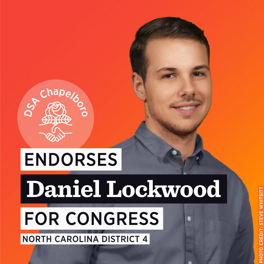



Slogan
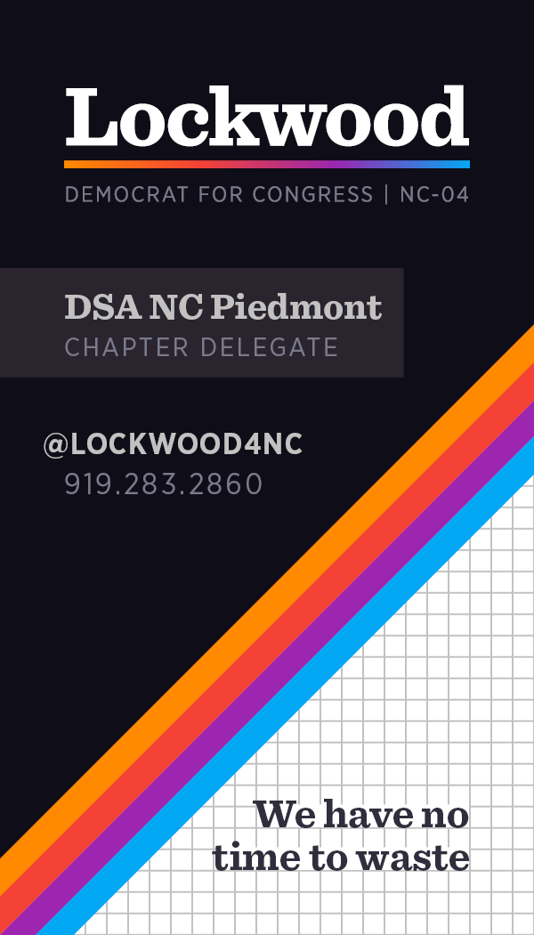
“We have no time to waste” is a statement on the urgency of the world’s current situation. Serious, sweeping changes are needed to combat economic, environmental, and social injustice.
Branding
To best reach voters, our brand was rooted in a sense of shared familiarity. We borrowed aspects of design from the Nineties, a time where the general outlook toward the future was brighter. The success of the brand, like the success of the campaign, hinged upon concepts that could only resonate through collective experience.
We needed a robust brand, one that could evolve and flourish with the input of volunteer designers. To account for different stylistic choices of these volunteers, organic motifs had to mesh with straightforward, geometric graphical elements. The referenced artistic movements all capitalized on the natural juxtaposition of organic vs. geometric.
Moodboard
Vaporwave is a microgenre of electronic music, a visual art style, and an internet meme that emerged in the early 2010s. The subculture grew from a surreal, collective nostalgia toward earlier decades, most notably the 1990s.
Memphis is a postmodern art movement originating from an Italian interior design studio in the 1980s. It is characterized by ephemeral design—featuring colorful, abstract decoration and asymmetrical shapes.
The graphic design of VHS Packaging represents the innovative frontier of computer-generated imagery that exploded in the 1990s. Artists and designers created works with no precedent.
Typography sample
The primary typeface is Sentinel, paired with Gotham Narrow. I sought to communicate strength and professionalism while maintaining approachability and readability.
Color usage & inspiration
The color scheme for the campaign came to me in a dream years prior. I’ve since found the combination of hues being utilized by other designers in a range of projects. To me, the color scheme represents the cosmic connection of all consciousness—and it appears that other designers concur.
The bold yet complementary hues were assigned to categories that make up a larger, cohesive picture—most commonly used to highlight our three areas of policy demands. Additionally, natural associations existed between our color scheme and allied political organizations.
Ways we were seen
For many people, this part is what makes a campaign real. I am proud of how we presented ourselves to the public, although I wish we could have done more.
Campaign flyer
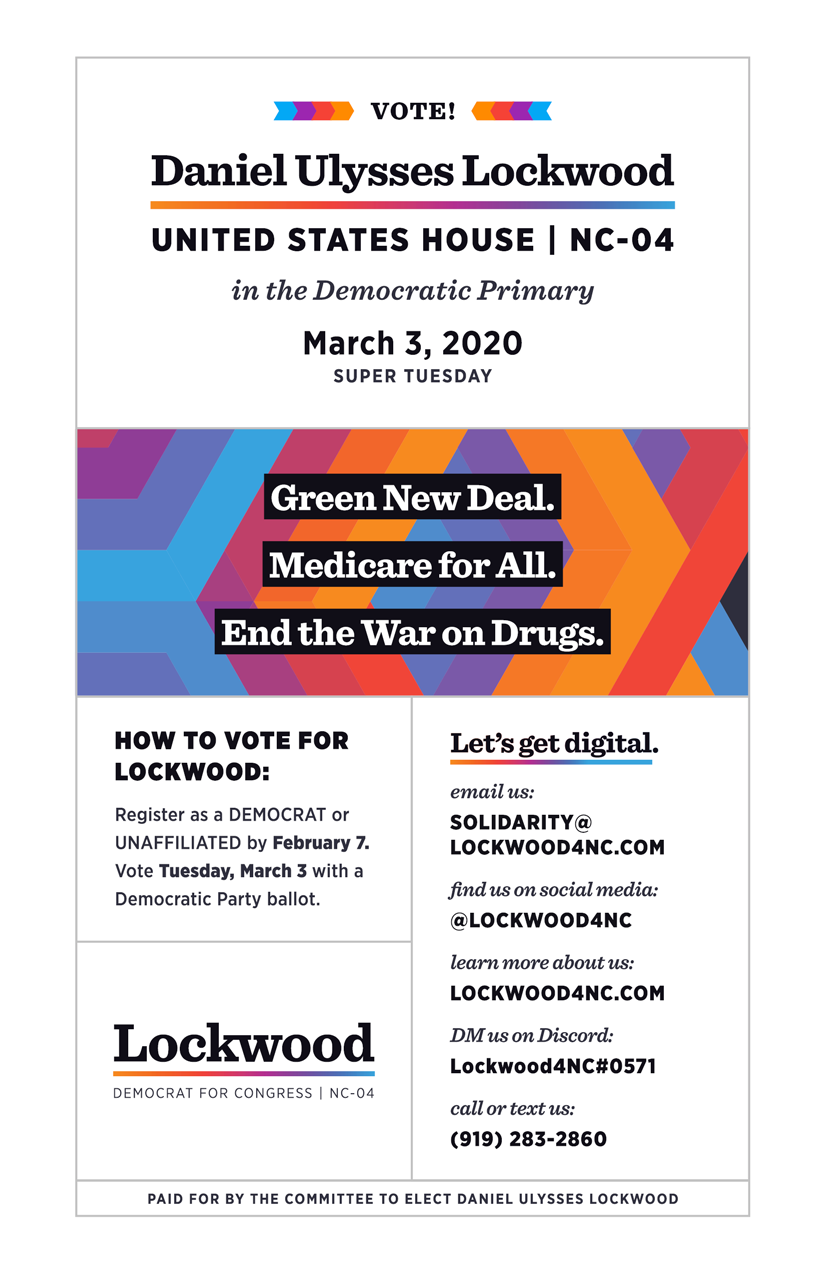
This mass-printed, cost-effective half-sheet was designed to provide everything a voter needed to know in an appealing, efficient manner: who we are, our Big Three issues, when/how to vote, how to connect.
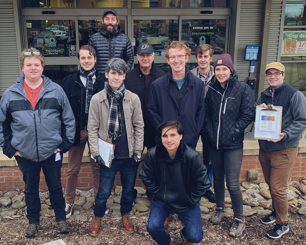
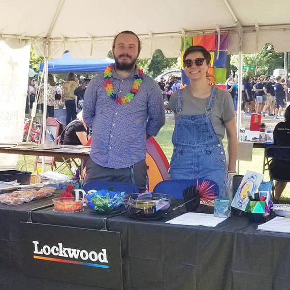
Tens of thousands were handed out over the course of the campaign at all relevant events.
Campaign website homepage
Designed in Adobe XD and developed using the Wix sitebuilder.
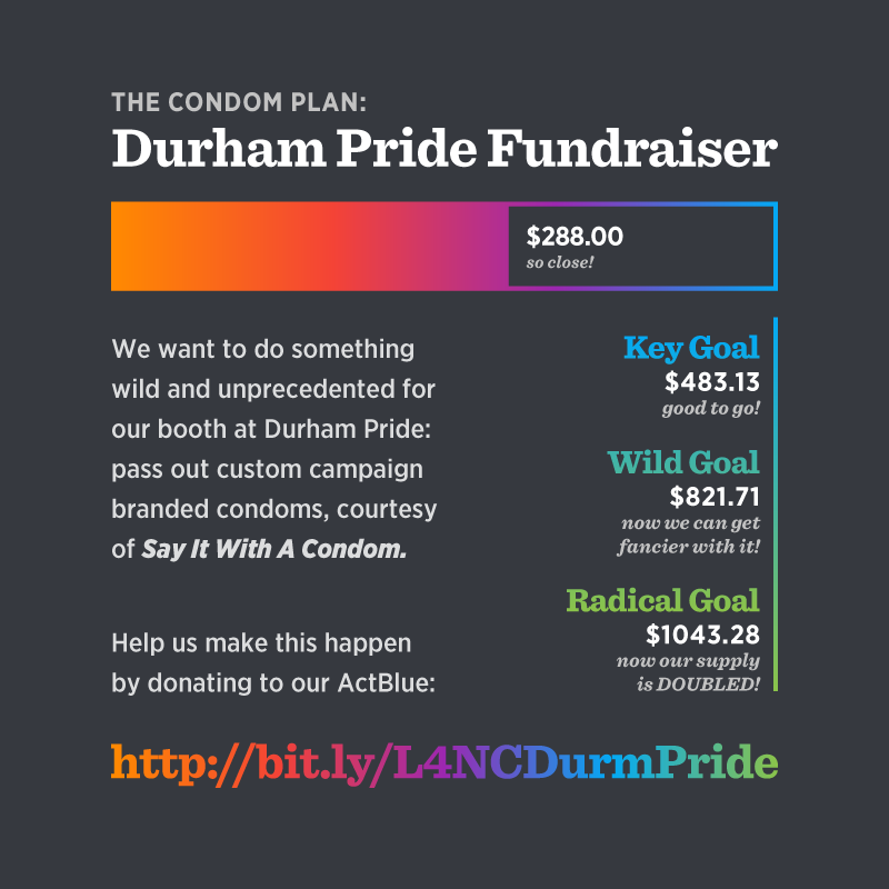
Condoms!
You read that correctly.
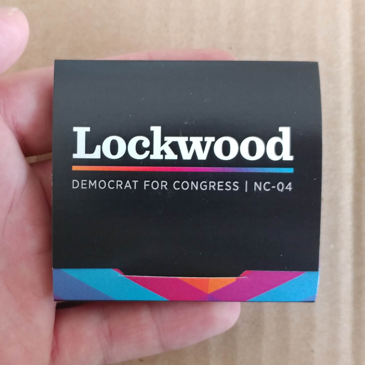
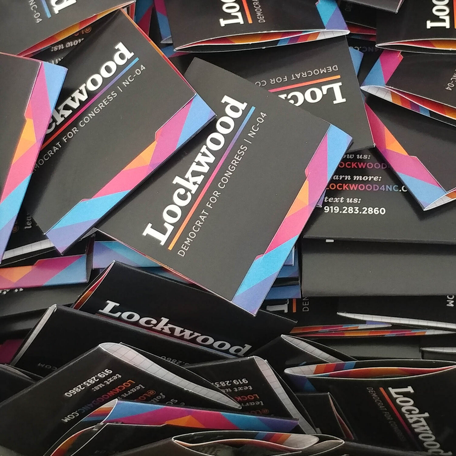
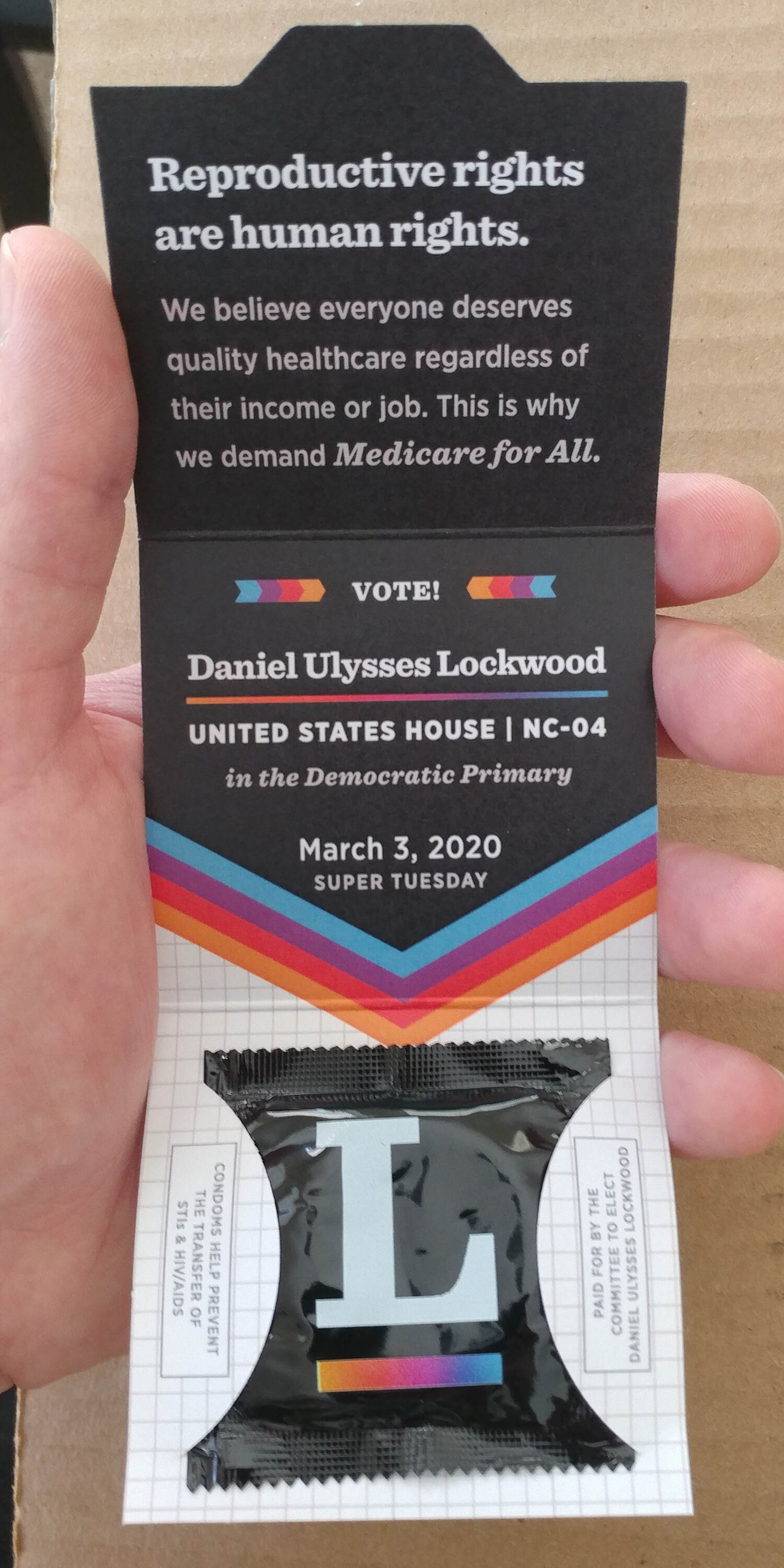
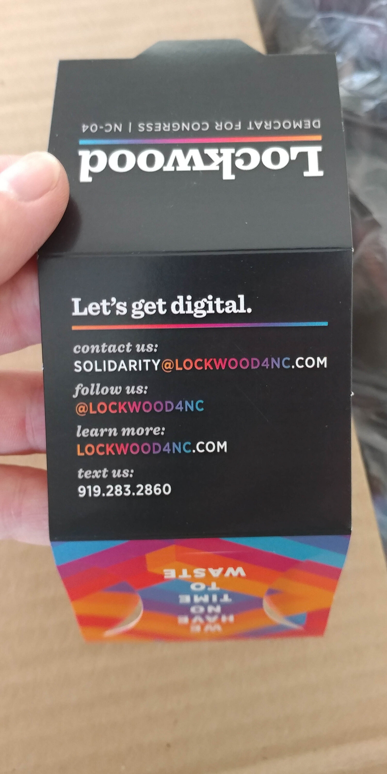
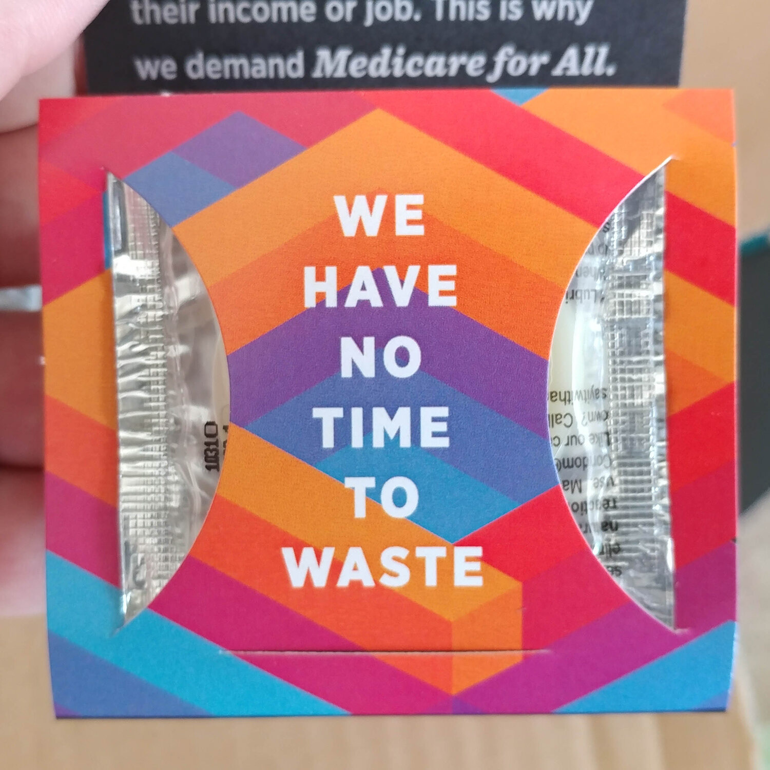
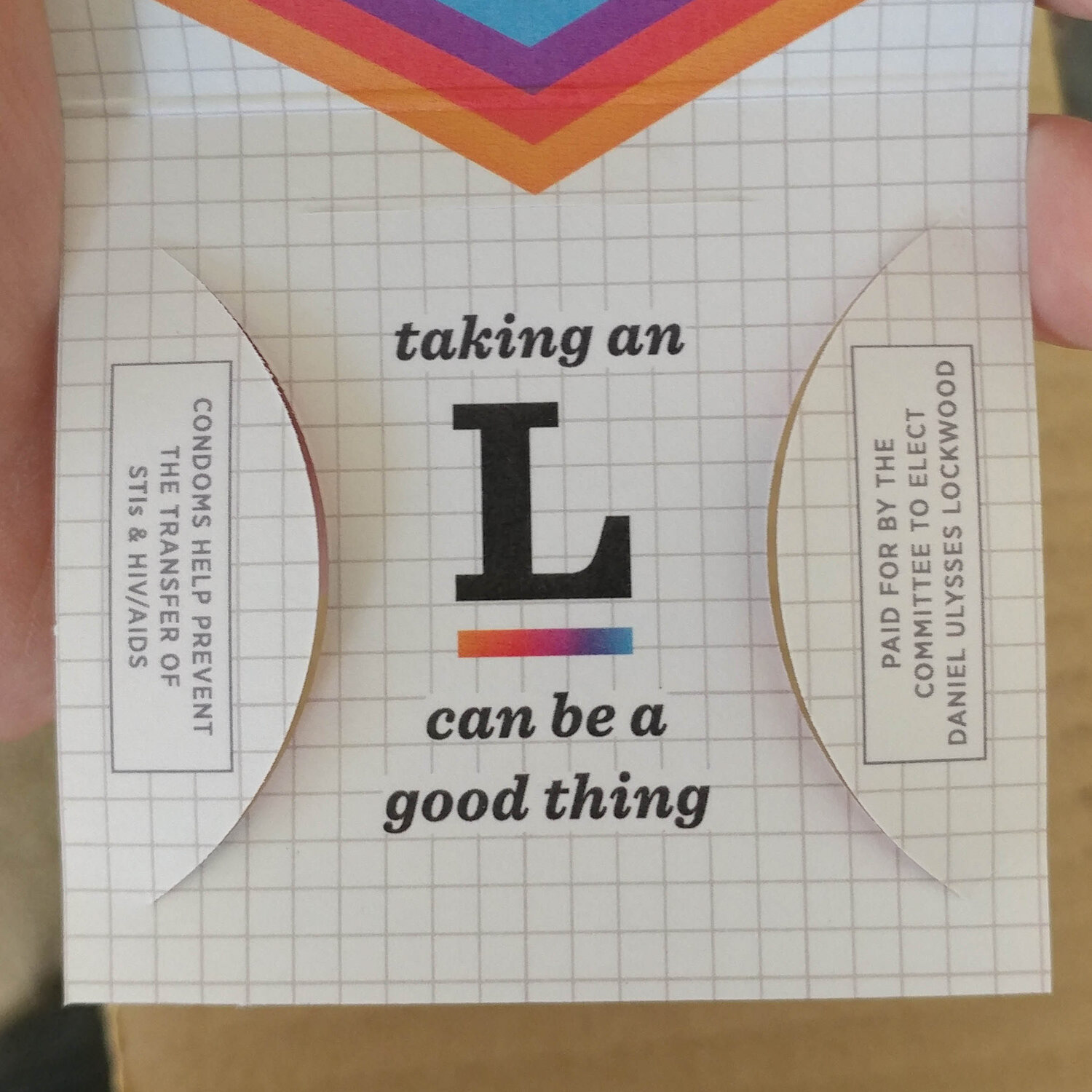
Our campaign’s condoms represented our commitment to reproductive healthcare justice and the fight for universal healthcare. These were handed out for free at relevant events—demonstrating that commitment.
Regarding political views
It would be strange to separate these designs from the context of the campaign's platform. My intent is to show the design behind the campaign, not to preach.