
The confident first approach
Before our first meeting had finished, I began thumbnailing. The client shared the vision of their business and explained their core principles. Although they were not sure where they wanted to go with the brand, they provided some visual preferences and boundaries to set a direction:
No pink!
Brown should not be the primary color
Greens, yellows, and reds are favored; mosaic colors
Lush vibes, not "deserty" (like a cactus)
Feminine, but not too feminine.
Energy, vigor, spirit, enthusiasm, brightness, healing
Organic, natural, earth-rooted vibe
Connection, reflection, and growth
The client also expressed their love of plants. Immediately, I fixated on the concept of a brain growing and blooming like a flower—a representation of the brain healing from trauma.
I wanted to use abstract, organic forms to make up the concept. If it was going to work, it needed to be elegant.

This is the result of fixation immediately following our first meeting.
Normally, you're supposed to thumbnail a lot at the start. You want to stick to pen and paper until you've explored several ideas. Well, I got carried away, and took this concept right into Illustrator.
After hours of refining shapes and curves, I had something I was proud of.
I decided to throw out convention and chose to share this with the client immediately. Their reaction would guide my next steps, positive or negative. I needed to know if the client's excitement matched my own.
The color palette with cooler, blue tones sought to communicate a state of calmness and healing.
Presentation #1
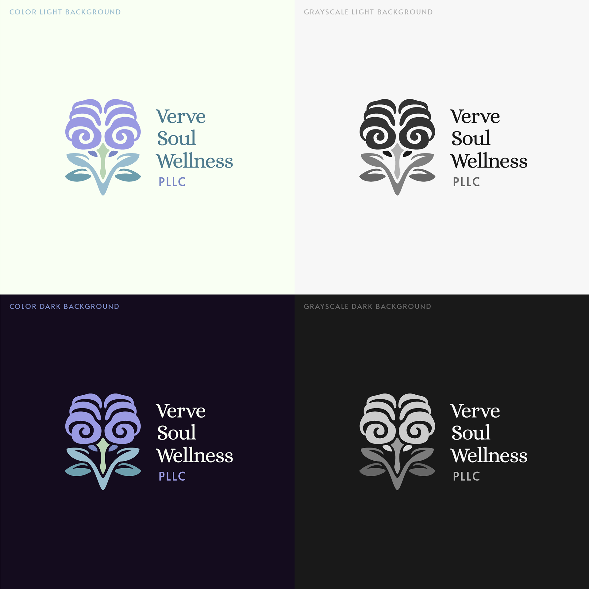
I like to present logos in both color and b&w to show the client how it will change based on its environment. I wasn't super confident in that colored background, but I was antsy to get the concept in front of the client.
The client liked the concept but wanted to see another color scheme. The typefaces didn't hit the mark, either. I retreated to Illustrator to proceed, exploring new fonts and building a warm color scheme.
Presentation #2

This time, I provided the client several typographic options to show them the different ways we could proceed. The warm color scheme was immediately approved.

This guide aimed to show the various personalities you can communicate with typography. The client was torn between the second and third options. On reflection, I felt that the weight of the second was a little too heavy, and so I told the client that I would keep exploring options.
I remember the first reaction from when they opened the file disappointing me—it was clear they didn't love it, even if they accepted it.
Intrusive thoughts
Does something feel "off" about this design to you? It felt off to me. And I couldn't ignore that.
The form was too complex, so details were lost in smaller use cases.
I pulled out my notebook and restarted.
How do I visually represent a soul?
There may have been another way of representing the concept of the brain blooming.
Moving away from the first concept, I explored forms to represent a "soul" or "heart"—in reference to a person's inner spirit. How do you visualize a concept recognized across so many diverse cultures?
Many forms were inspired by various flora, as a way to represent the growth and vitality of that inner spirit.
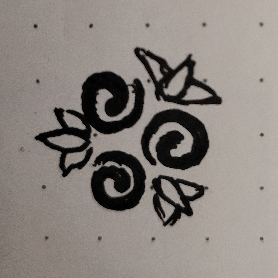
After more thumbnailing, a strong contender arose.
After more thumbnailing, a strong contender arose.
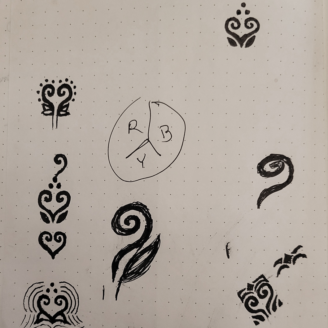
The heart/soul flower is born.
I love the sight of a spiraling fern. There is an elegance to the way it unfurls as it grows. With a bit of vertical symmetry, the form of that spiraling fern makes a "♥" shape—a nearly universally recognized symbol.
Around that base shape, I included other elements of significance:
The leaves represent the foundation of the inner spirit as the energy source of a plant.
The three dots represent "Connection, Reflection, and Growth," the client's slogan.
Together, the elements and base shape combine to form an abstract flower. I brought the sketches into Illustrator, refined the shapes, added color, and placed them in context with typography options.
It was time to show the client.
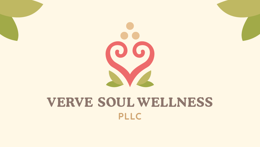
Presentation #3
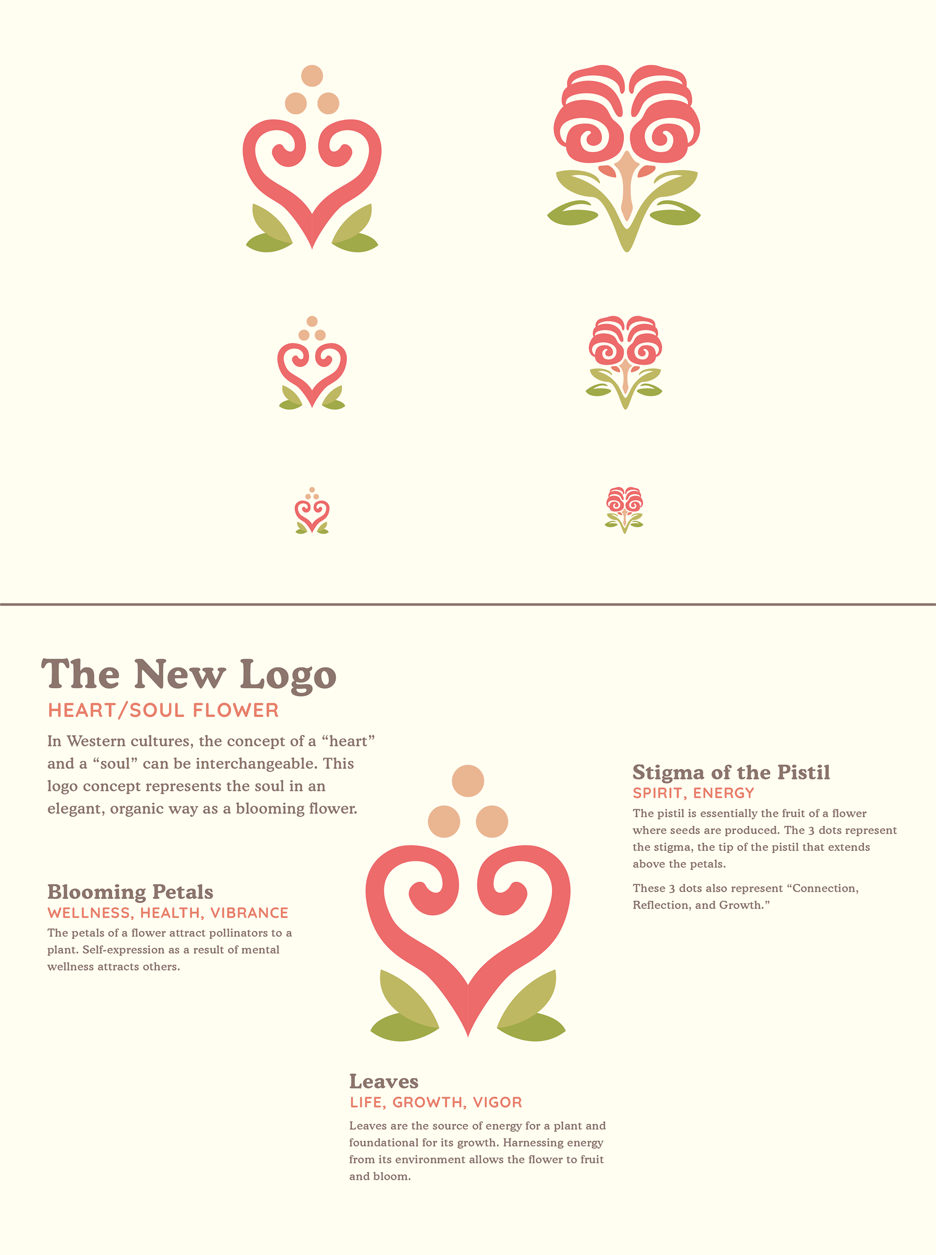
This image shows why I moved away from the first concept and why I was confident in the new one.
I explained the meanings behind the logo and all of its elements.
I explained the meanings behind the logo and all of its elements.
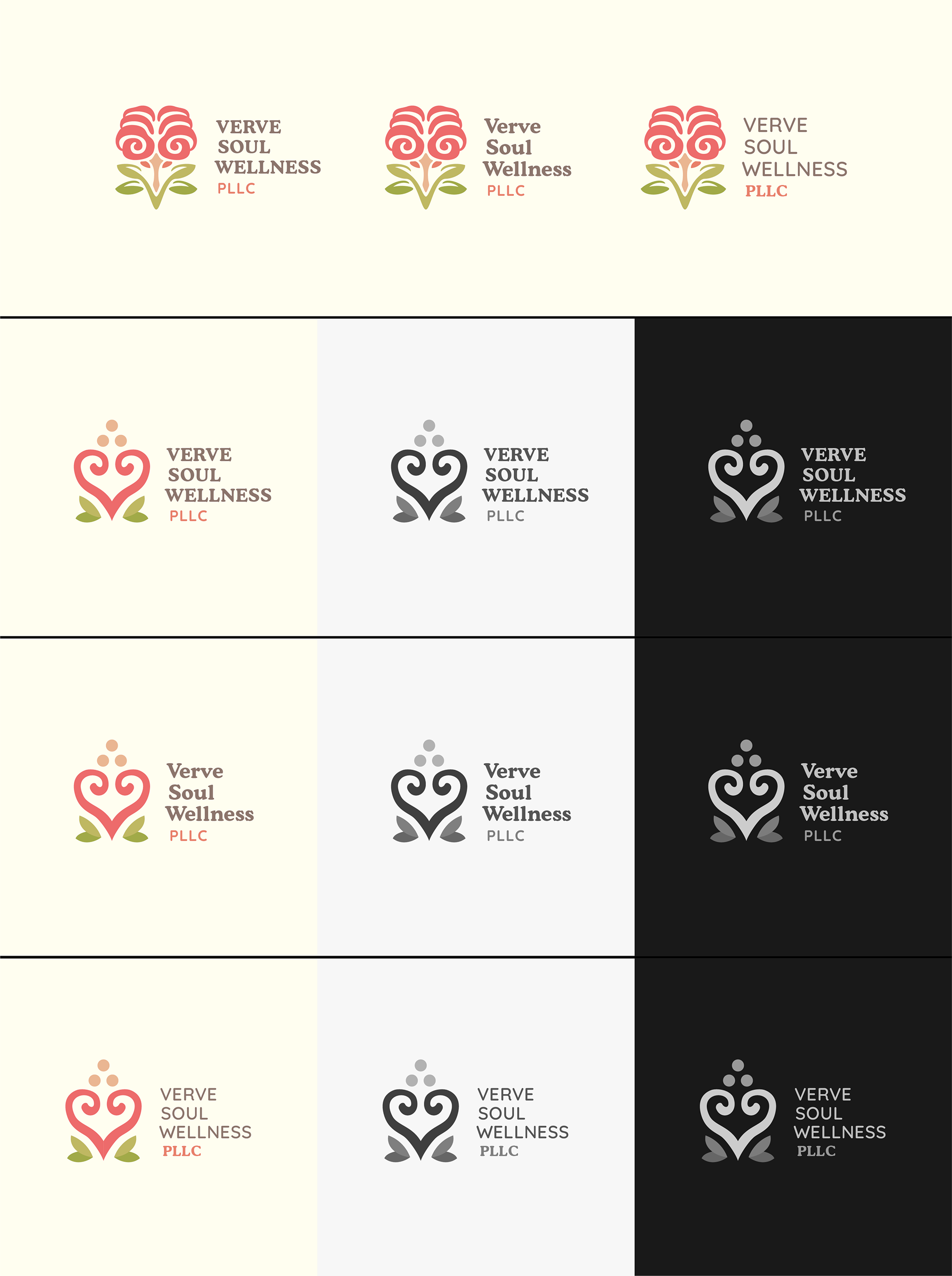
I luckily found that someone had made thinner weights of the stylish and vintage Cooper Black font. This paired nicely with the rounded, sans-serif Quicksand font. I refined the typographical options from Presentation #2, providing the same vibes as choices while funneling the outcome to using this pairing.
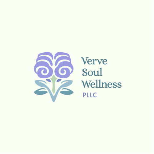
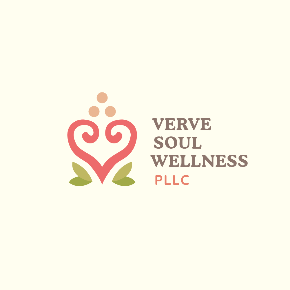
Chosen variant
What I had hoped for
This time, the client fell in love with the concept. We moved forward with it.
I'm now in the process of refining the brand identity to fit the client's needs. I feel very good about where the project is headed, and I can't wait to share more as I design.